DESIGN BRIEF
For this project, I was tasked with designing a packaging for a fair trade chocolate bar in three different flavors. The design was to be based on a randomly assigned country that exports fair trade cocoa. I researched elements of this country such as colors, cultures, landscapes, and patterns to get design ideas for the packaging. I also looked into other packaging from current chocolate companies for inspiration, as my design was required to fit in with the aesthetics of the organic, fair trade food industry. I was then to apply the design to a die line and build the physical packaging.
RESEARCH
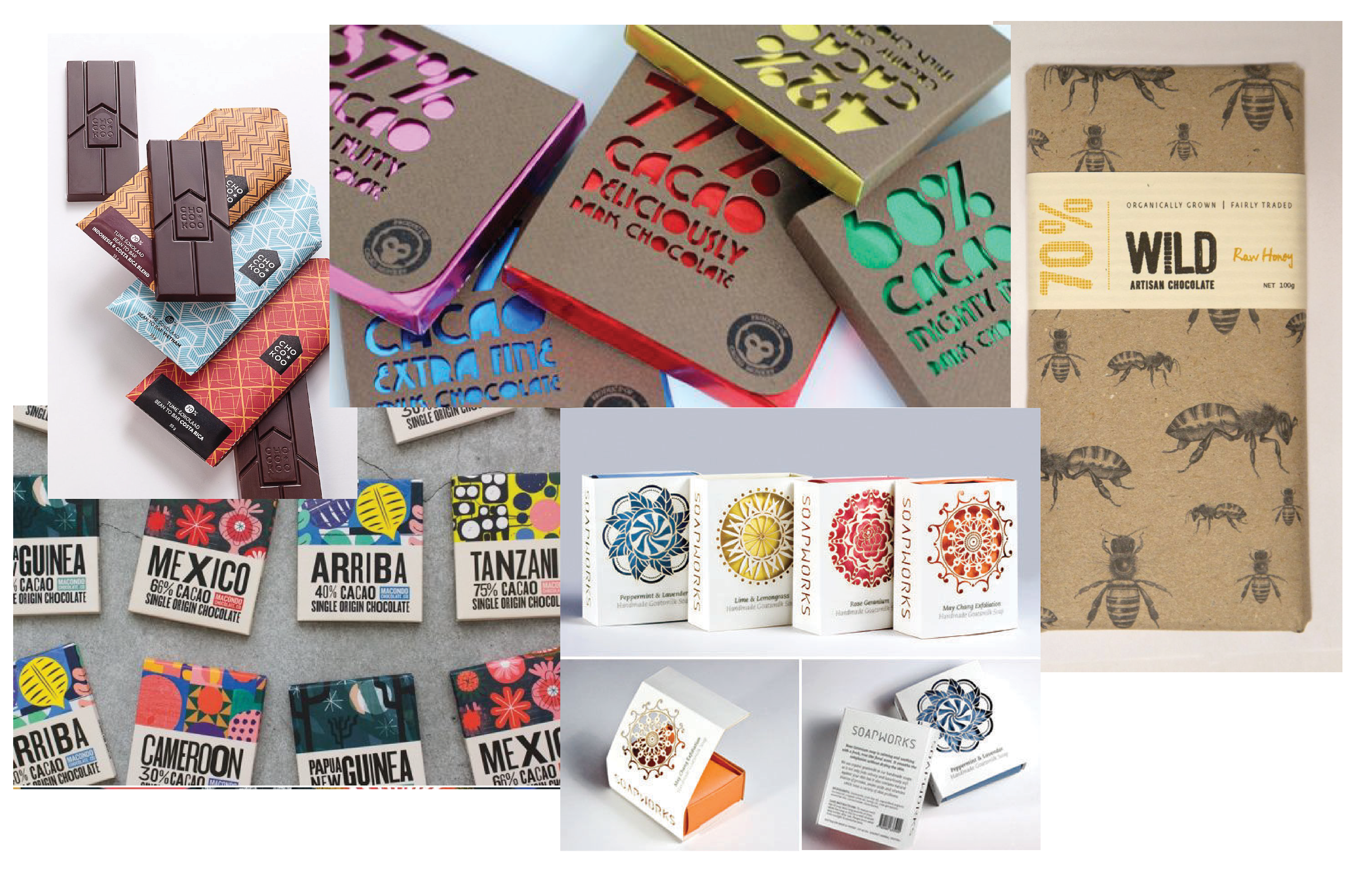
The first step of this design process was to begin exploring the culture of the country I was assigned, Panama. I created a document where I outlined each aspect of the country's culture, such as biodiversity, food, history, arts/crafts, and fashion. I then created a visual mood board based on the information I learned. I also collected images of existing chocolate bars that I wanted to draw inspiration from; I made sure to take note of the aspects that categorized them into the fair trade organic realm, such as color, texture of paper, hierarchy of information, and logo elements.

DESIGN ELEMENTS
Considering what I learned during the research phase, I decided to center my design around Panama's abundant bird population. I was also inspired by the design of the iconic geometric design of the "PANAMA" sign found in Panama City.
For my logo, I wanted it to feel very natural and organic. I chose the font Wood Cabin for its hand drawn feel and delicate stroke. I then manipulated the last "O" character to look like a cacao bean in order to emphasis the packages contents. I chose Dunbar Low Book as my secondary typeface because it offers a neutral contrast to my display typeface, while still maintaining that clean, organic feel.
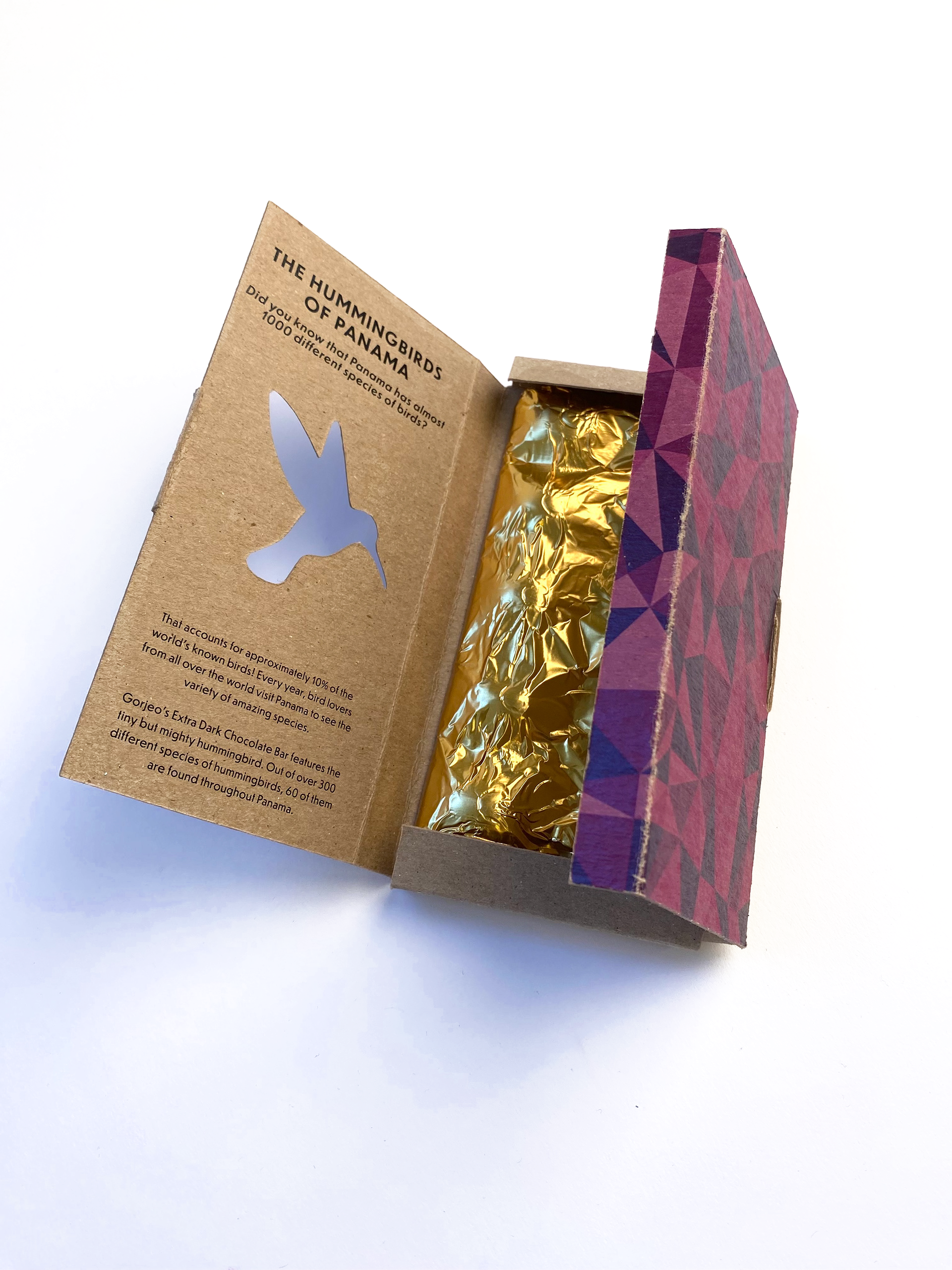
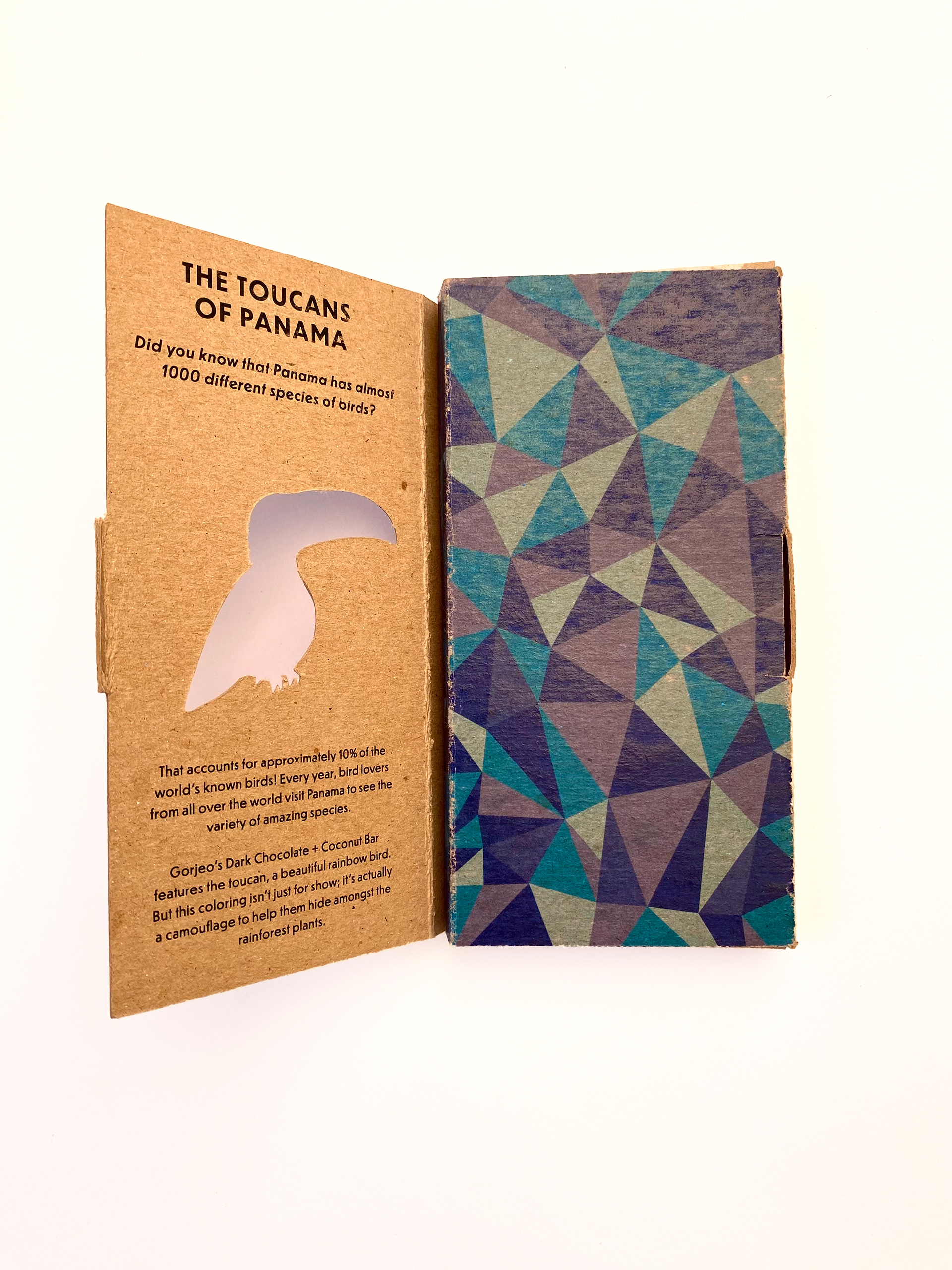
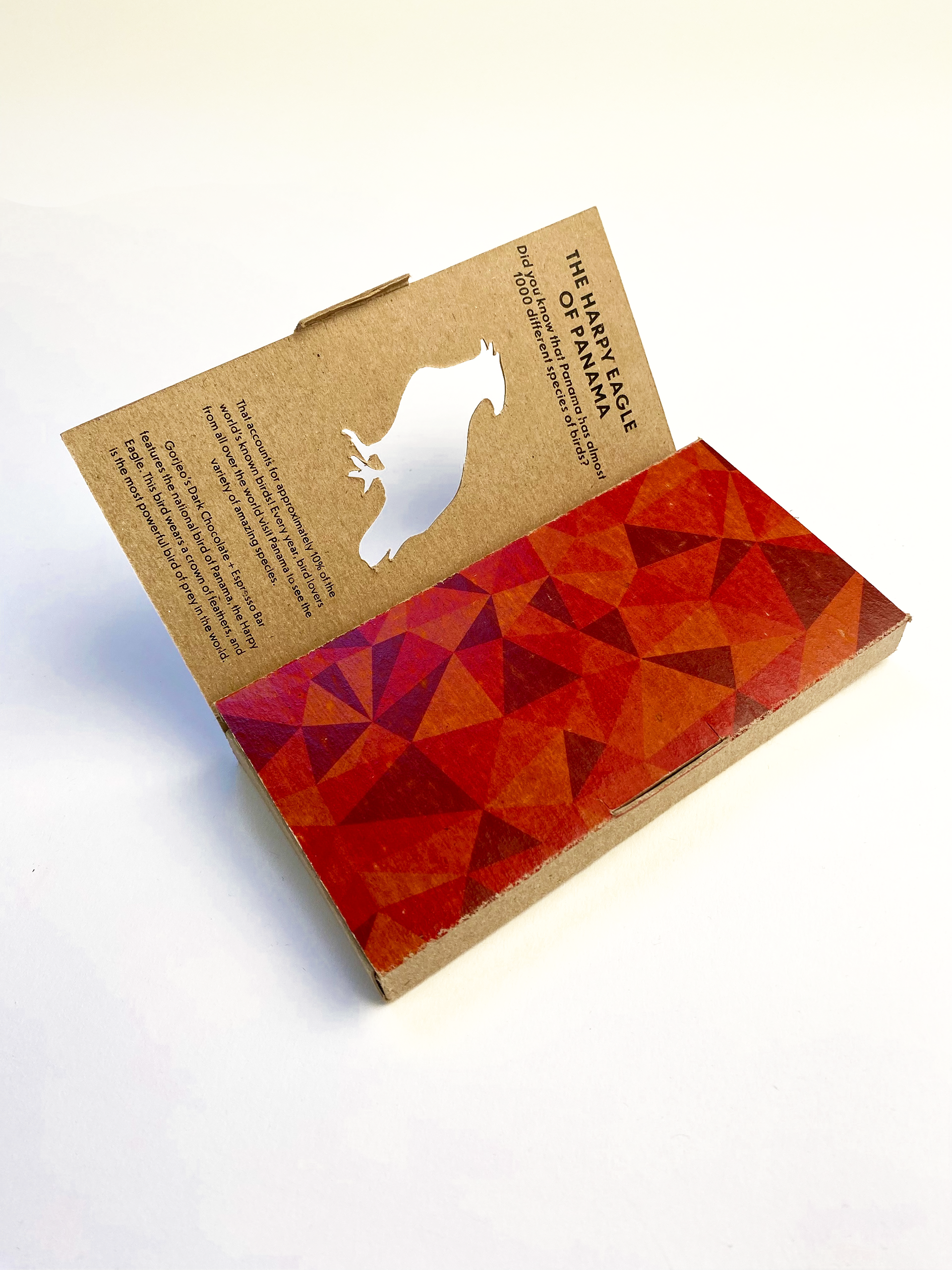
In order to distinguish the different flavors while keeping a unified feel, I chose to use the same geometric pattern from the Panama sign but use different tints and shades of a couple colors. Each flavor is also differentiated by a cutout of a bird that can be found in the country.
PROBLEM SOLVING
This project was the first time I had to physically build the packaging that my design would go on. I first found an existing die line template that fit with my design. I then bought a chocolate bar, took note of its measurements, and adjusted the die line to fit those dimensions. I test printed the die line first to make sure the package looked the way I wanted, however what I didn't consider was that the final product would be printed on much thicker card stock than the thin printer paper I tested on. When I went to the print shop to have my design cut out, it didn't quite fold the way I wanted it to, so I had to go in and adjust the die line measurements before reprinting.
DESIGN STATEMENT
For my final design, I settled on an organic, earthy look with subtle nods to the country of Panama. Because Panama is known for its abundance of birds, I named the company "Gorjeo", which is the Spanish word for the tweeting or chirping sounds that birds make. I also featured a cutout of a bird species found in the country and included some facts on the inside cover. Peeking through the central cutout is a bright, colorful geometric pattern inspired by the one seen on the sign in Panama City. In order to make it clear that the chocolate was fair trade and organic, I printed it on brown textured paper to give it that earthy feel. I also made sure the information was sorted in a very clean, uncluttered composition with lots of breathing room to imply the simplicity of its ingredients.
