Design Brief
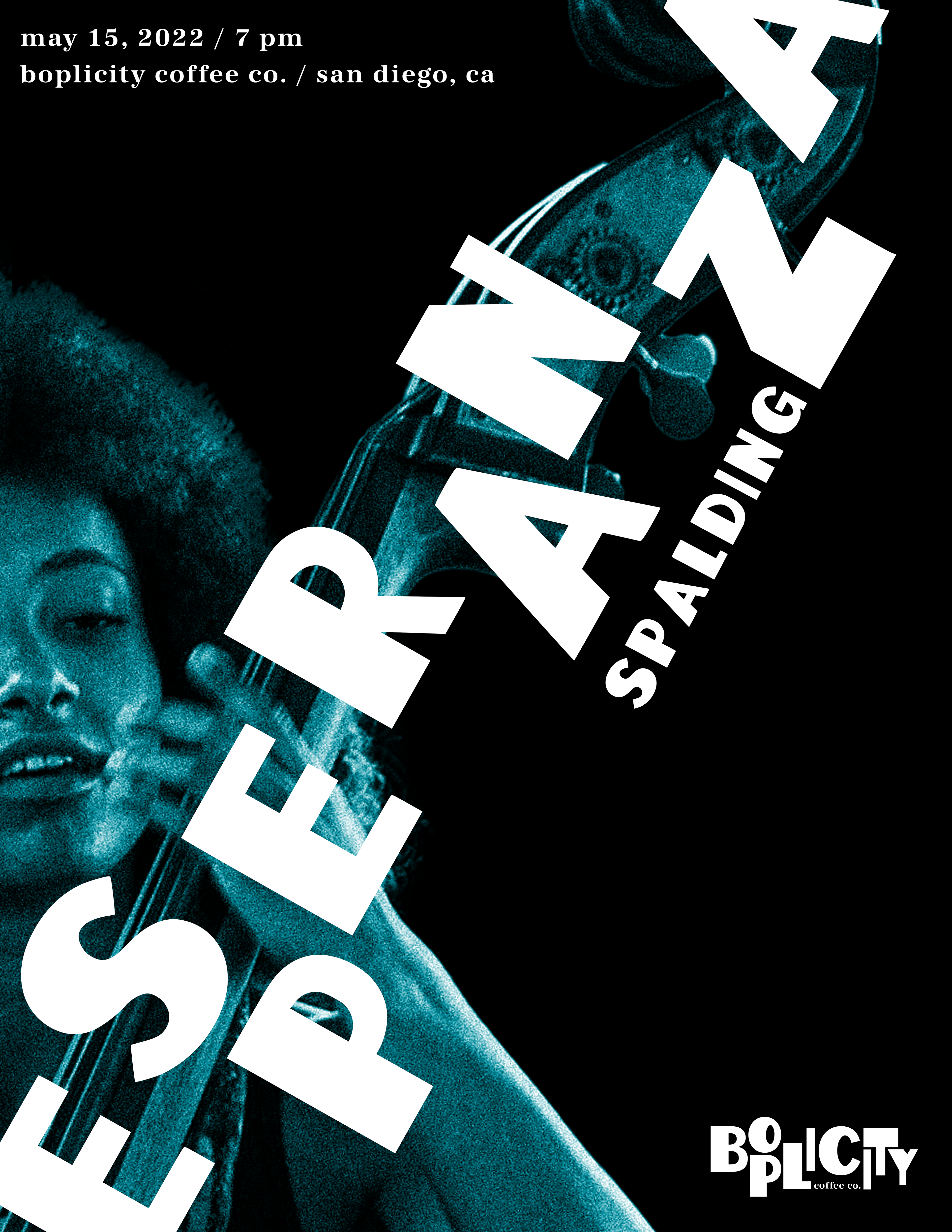
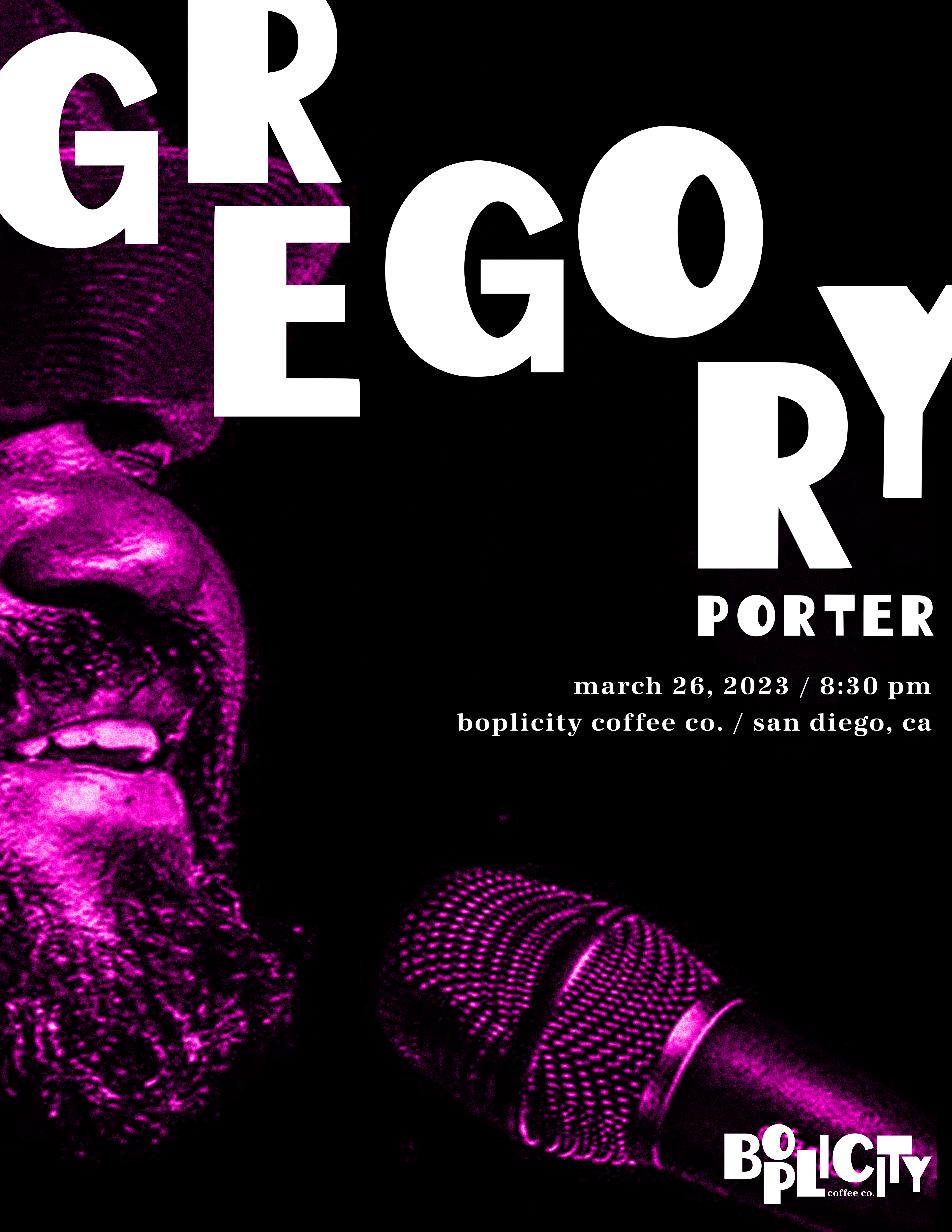
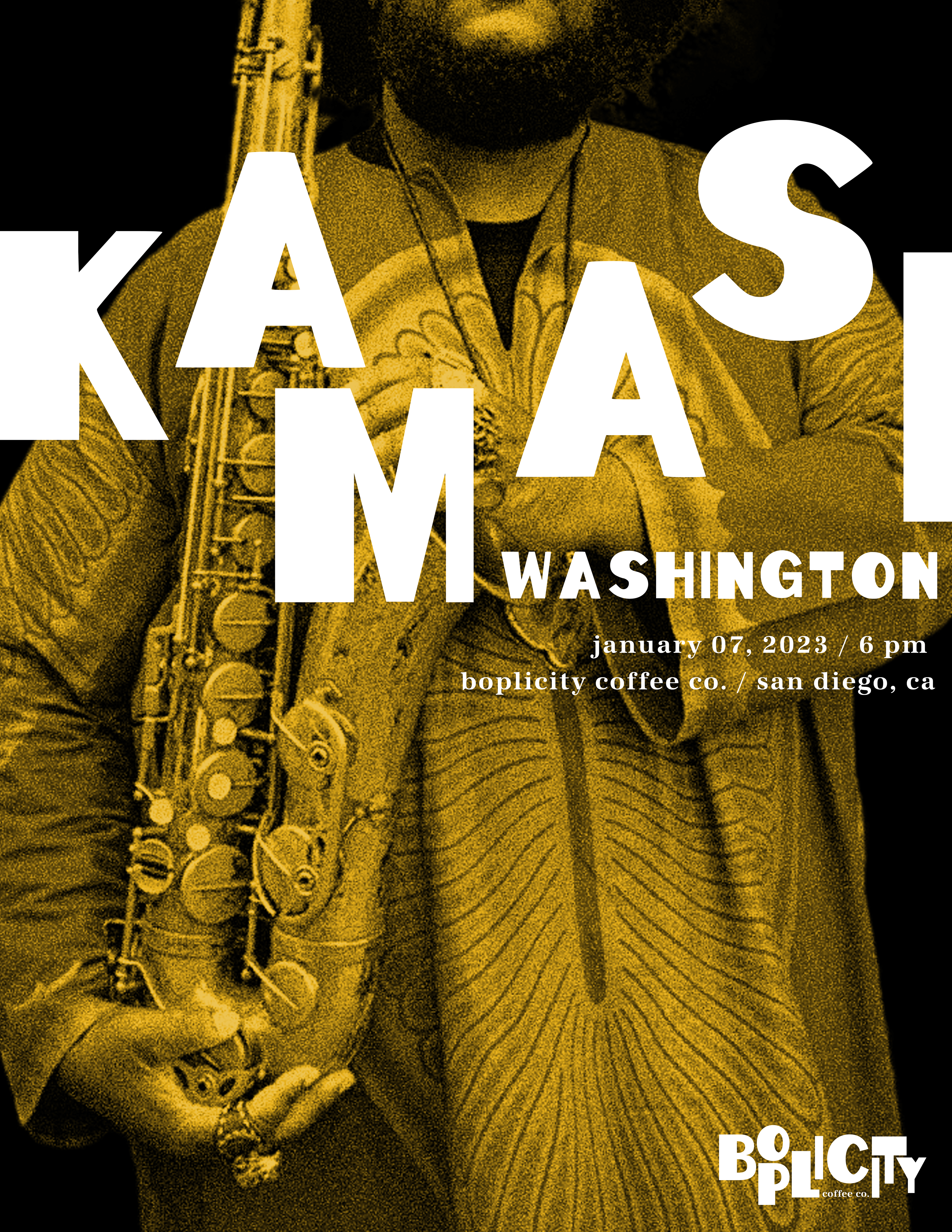
For this project, I was tasked with creating a custom typeface that would then inform the creation of branding for a music performance venue. The typeface was required to be a modified version of an existing typeface that was randomly assigned to me. The look and feel of the branding was to be based on a music genre, which was also randomly assigned to me.

Research and Development
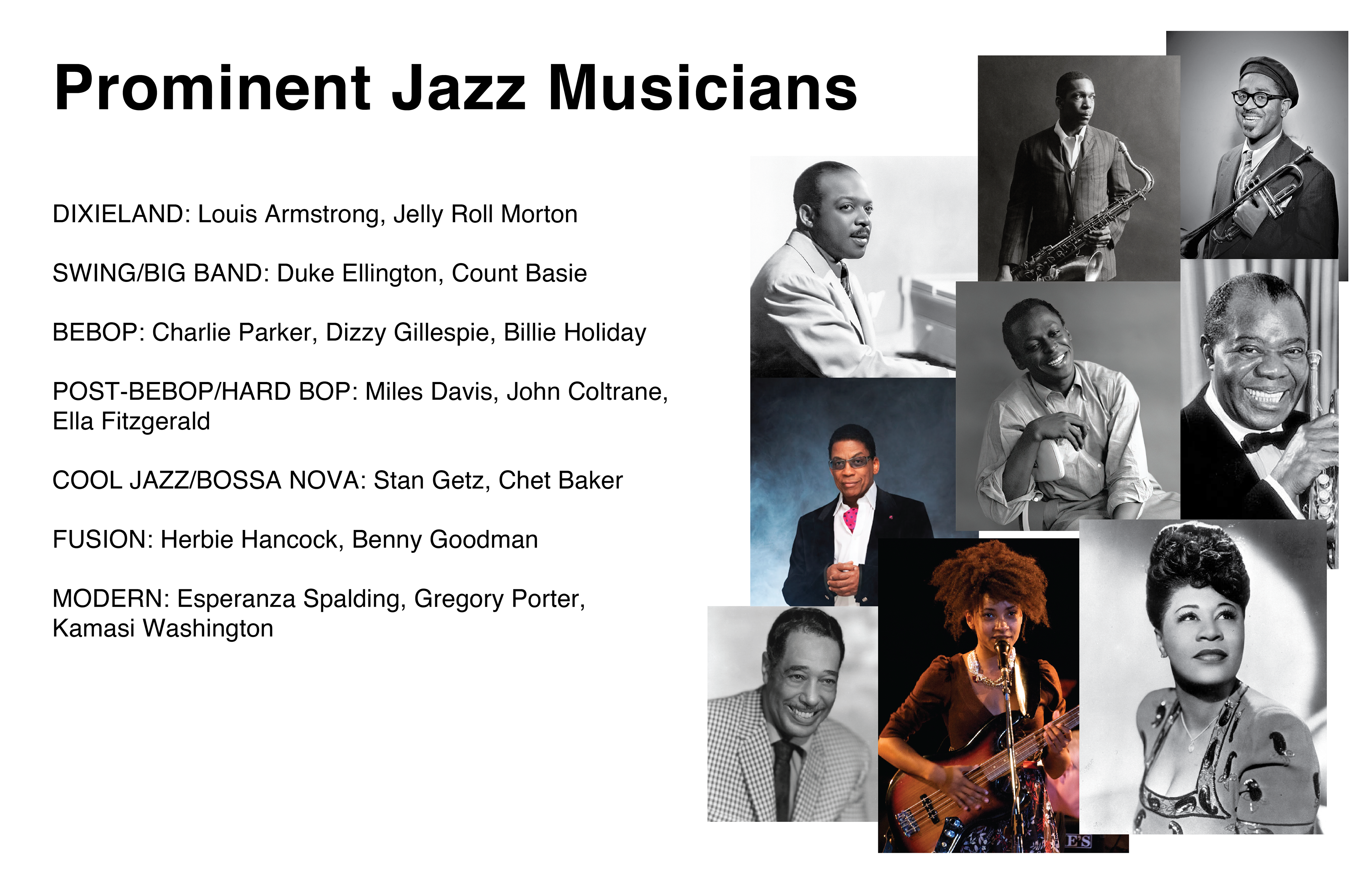
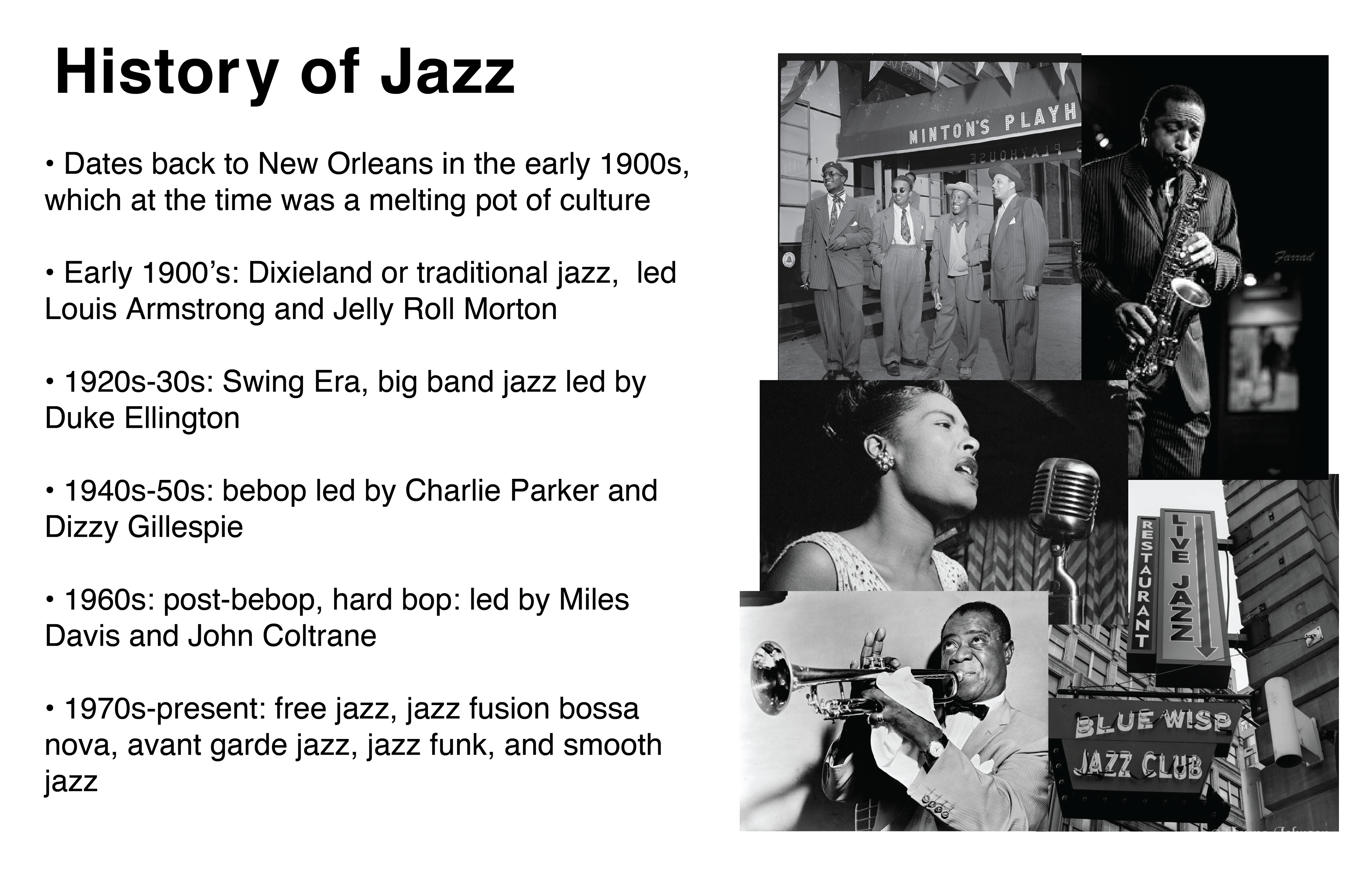
To begin my research, I first explored the musical genre that I was assigned: jazz. I researched the history of jazz, the defining characteristics of its sound, prominent musicians, the visual language of its album covers, and the brand identities of famous venues where it is played.
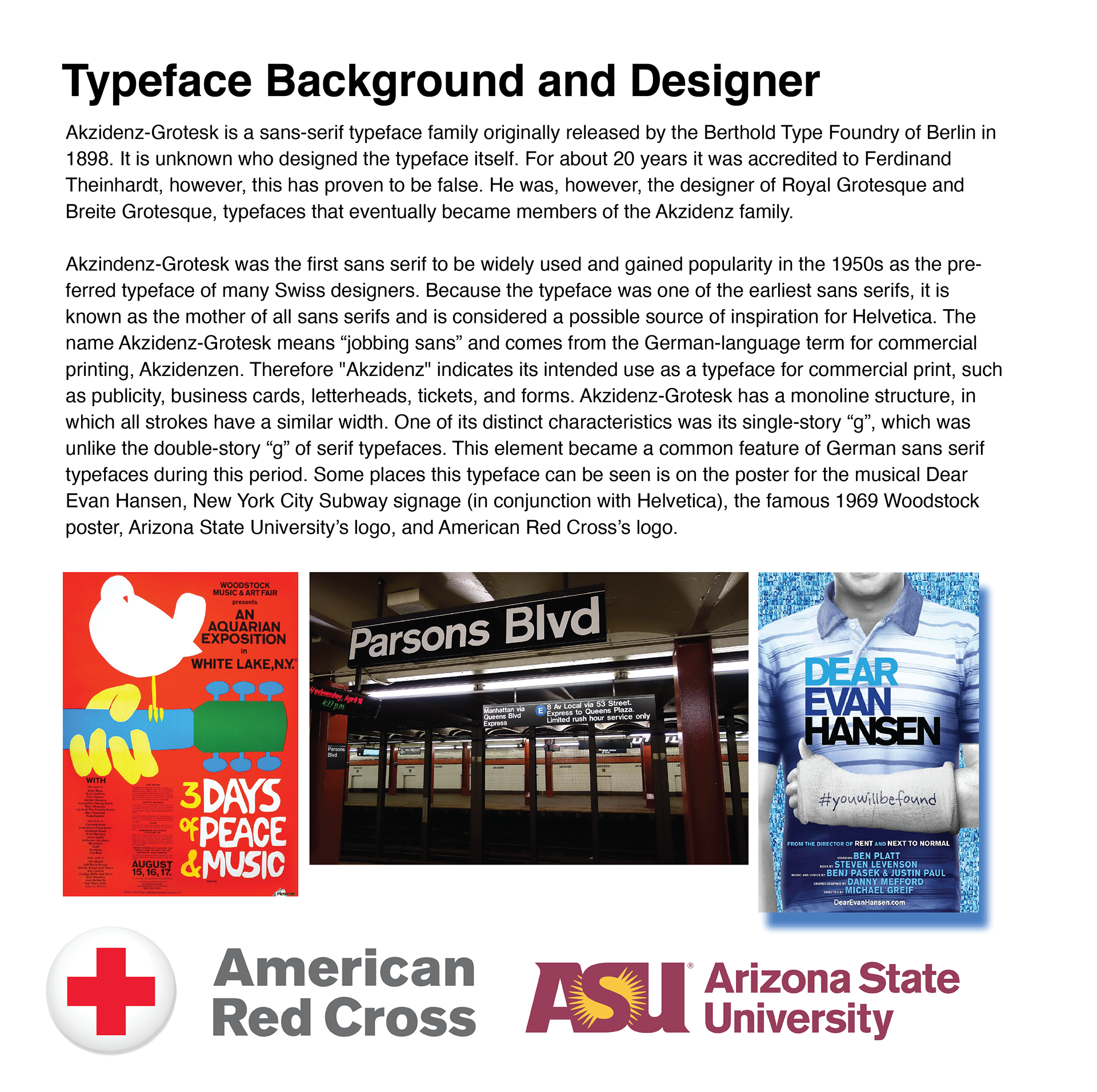
I also looked more into the history and usage of my assigned typeface, Akzindenz-Grotesk, to get a better understanding of how I might be able to modify it.
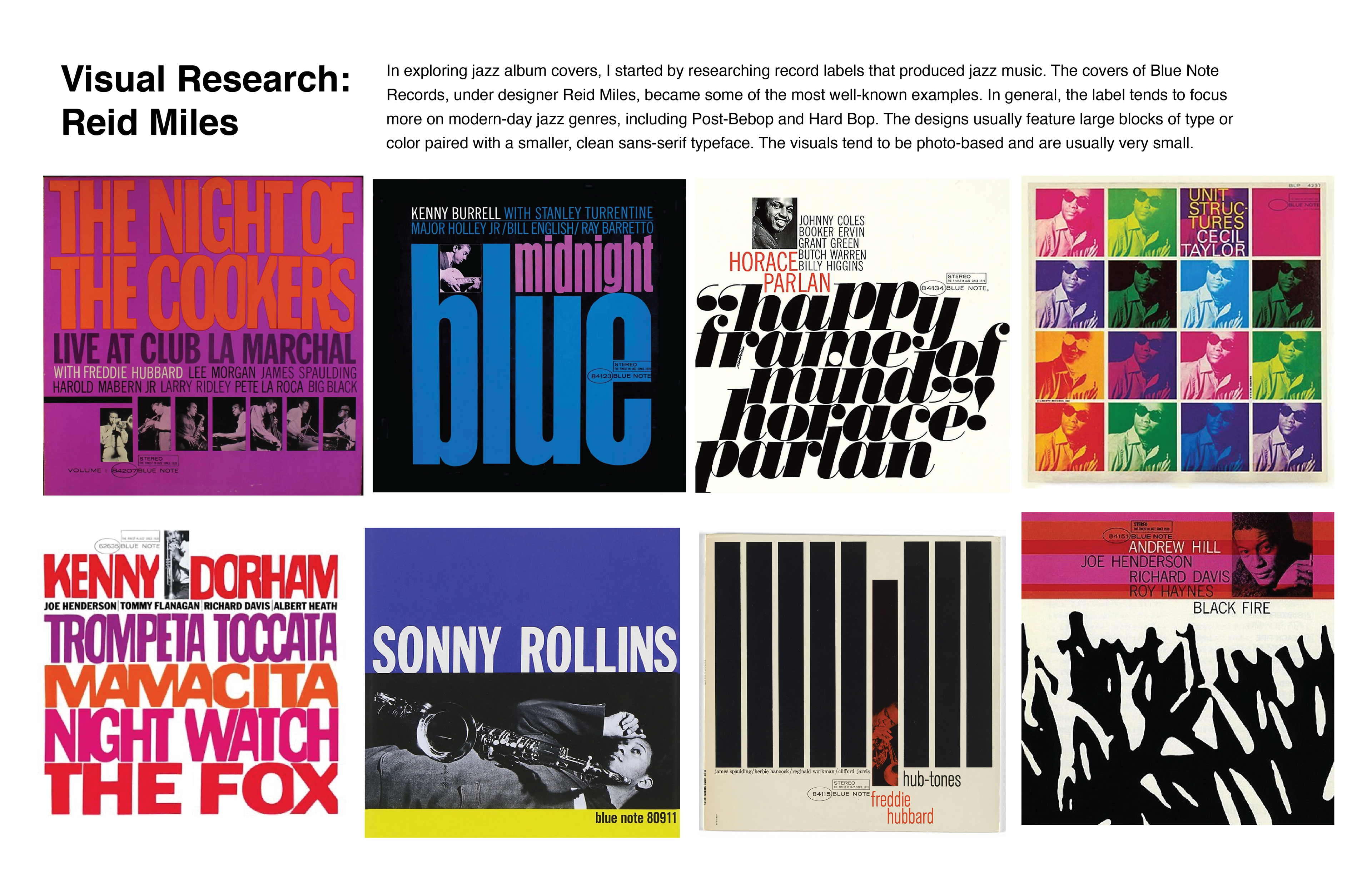
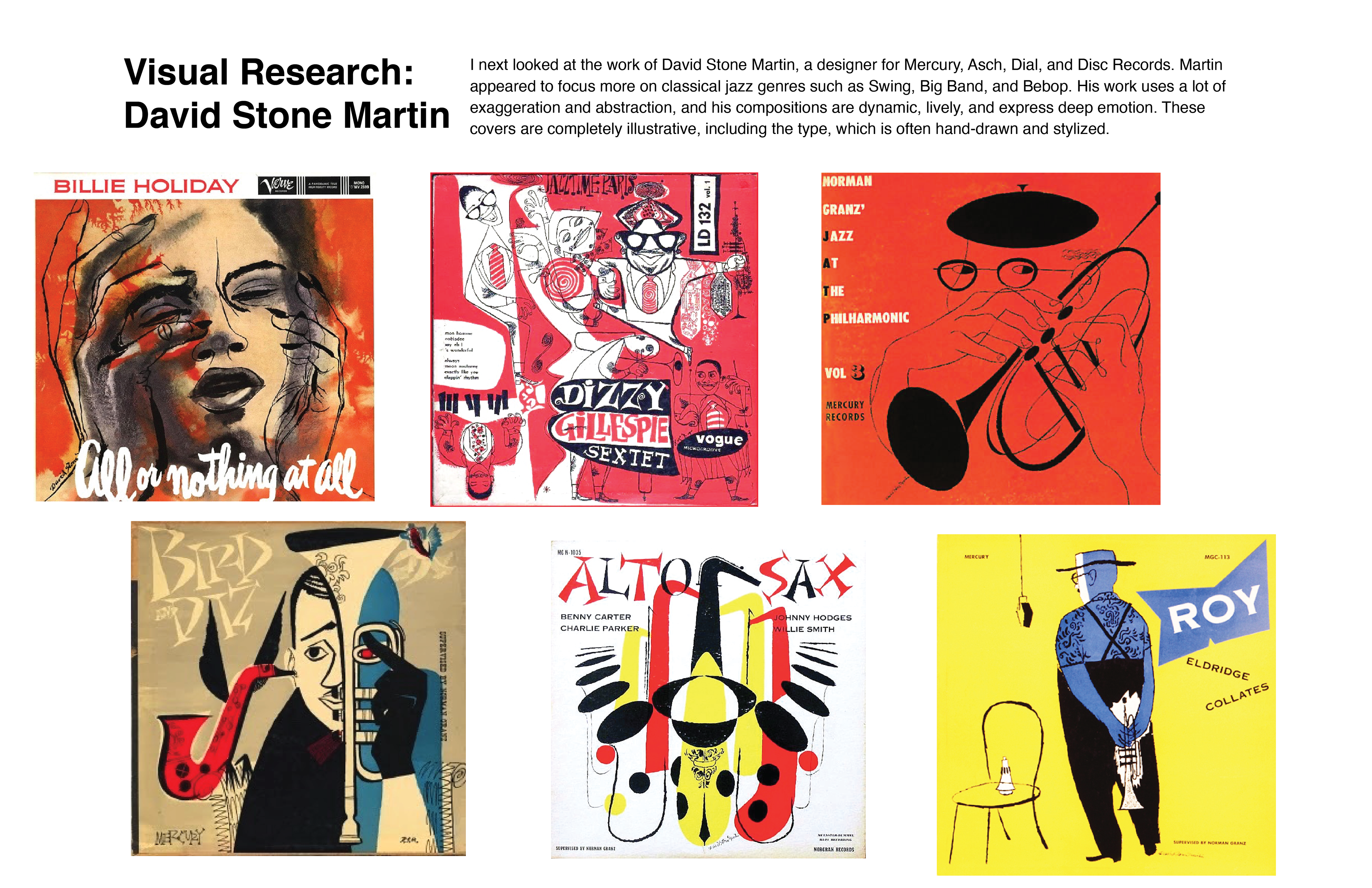
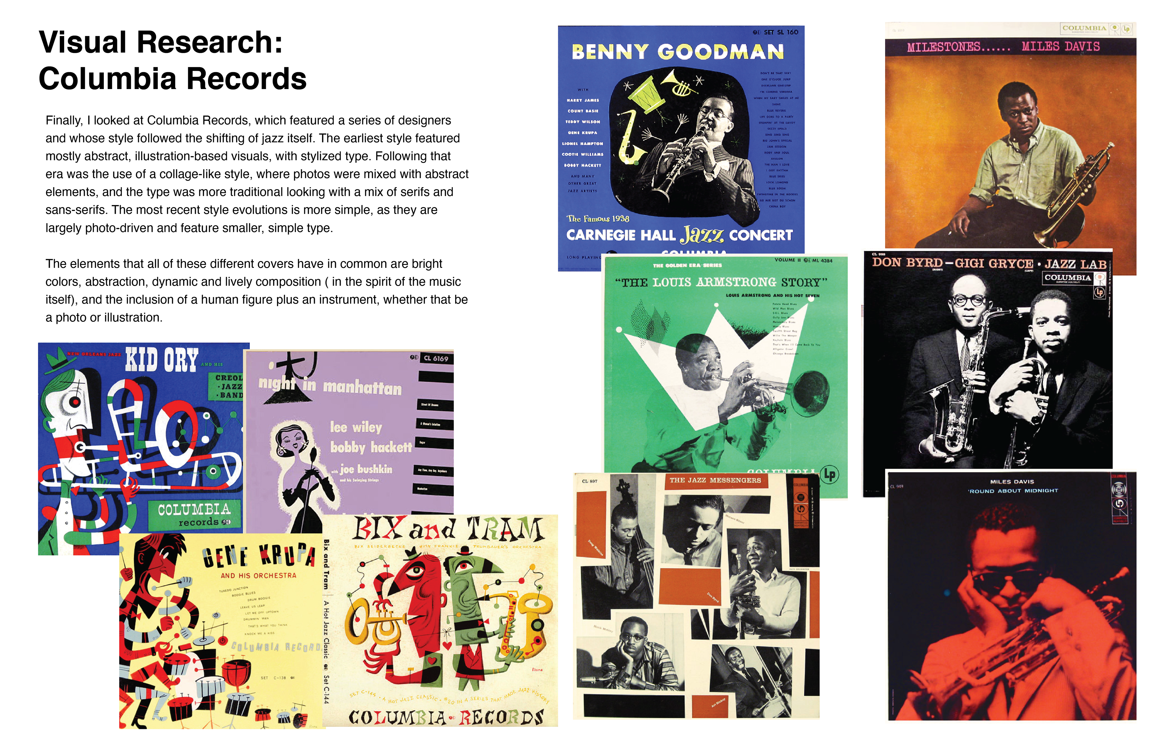
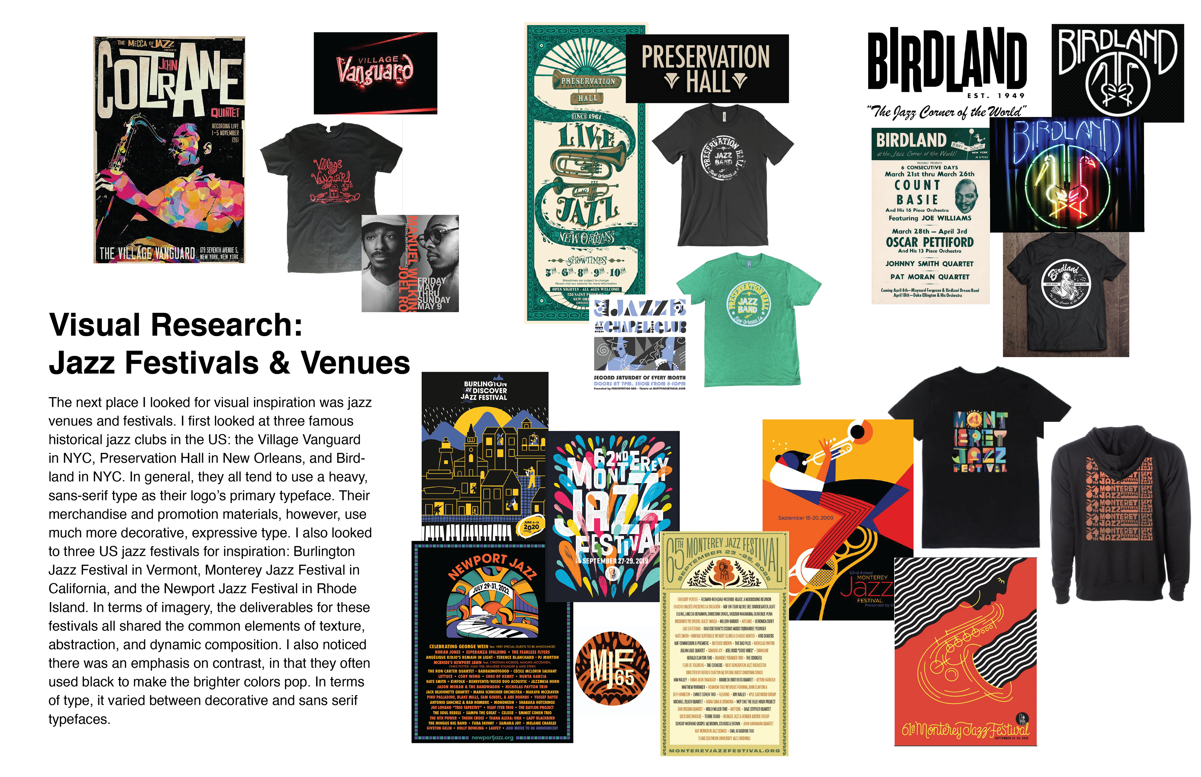
Based on what I learned in the research phase, I began experimenting with different typeface modifications that I felt fit the genre. I pulled inspiration from the fonts I had seen on jazz-related posters, album covers and logos.
Designer Statement
For my music venue branding, my goal was to create an identity that captured the playful essence of the music itself as well as its historical significance. For my typeface, I incorporated thick and thin strokes to represent the varying sizes and shapes of instruments used in jazz. For the logo, I arranged the letters in a dynamic composition full of movement to capture the energy of the music. My paper cup design is a nod to the prominent musicians who shaped the sounds of jazz. My palette utilizes bright, lively colors against a black background to mimic the neon aesthetic of historic jazz clubs as well as communicate a fun yet classy cafe environment.
