Design Brief
In this five-phase project, I was tasked with researching, user testing and designing an interface for a brand new shopping application. This project was created in collaboration with another design student, Kelli Thompson.
Phase 1: Research
The first phase of our project consisted of meeting with 4 likely users of our app and asking them questions about the shopping apps they use currently. After deciding our app would be thrift-based, we chose Depop as our main competitor, and created a user flow map to better understand their interface. We then outlined our value proposition to help users understand why our app stands out amongst its competitors.
VALUE PROPOSITION:
The first step we took in researching our competitors was conducting user interviews. We asked four individuals of varying demographics questions about the shopping applications they use most frequently, prompting them to discuss the features they liked or didn’t like. We discovered one general frustration among all the users was the “information overload” of the application’s home screens. Users also disliked the lack of personalized suggestions, and found difficulty in locating account information or order details. Additionally, users also cited aesthetics as an important contributor to their decision to use it. Especially in younger generations, the more appealing or unique an interface, the more likely they are to be drawn to it. Therefore, we will be creating a thrift shopping app that offers improvements to these frustrations.
First, we will create a home page with a simple, straightforward interface, so as not to overwhelm the user. This home page will also feature custom recommendations based on the activity of each particular user. Since this is a thrift shopping app where anyone can sell items, we will also offer personalization options for user shops, such as the ability to add a cover photo. Users of other thrift shopping apps, such as Depop, also noted a lack of transparency in item price and shipping costs. Because finding bargains is so important in thrift shopping, our app will address this issue by making these costs more readily accessible, presenting them at the forefront.
When designing our app, we would like to target those of the Gen-Z population. Not only does this generation tend to value low-cost, unique fashion, they are also major proponents of climate activism. Therefore, our value proposition is to create a thrift shopping app dedicated to eco-consciousness and sustainability. Our app will feature carbon footprint tracking, biodegradable packaging, and incentives for eco-friendly behaviors. In addition, a portion of the profits will benefit environmental organizations.
Phase 2: Personas, User Flows, and Wireframes
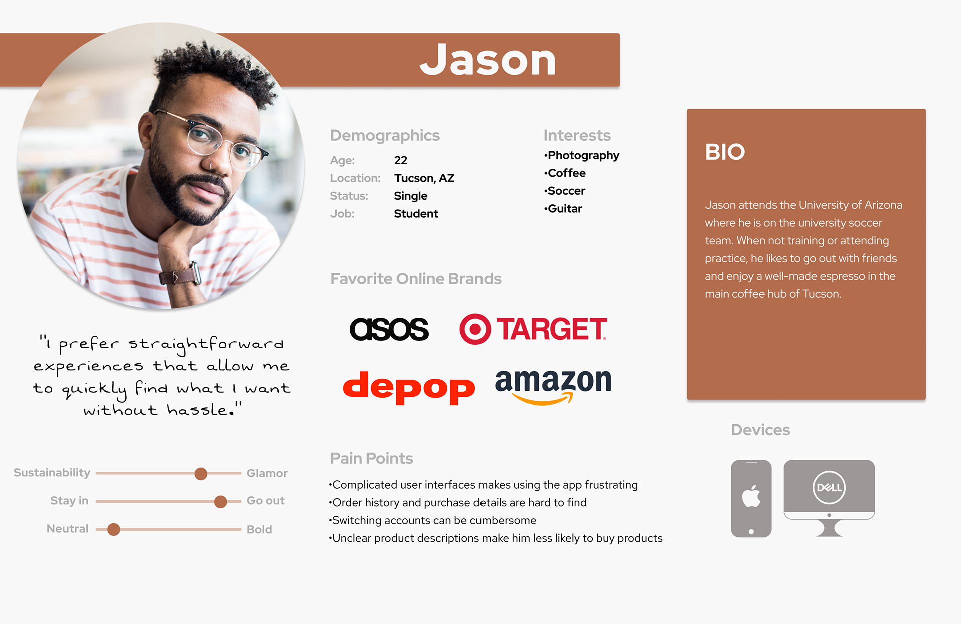
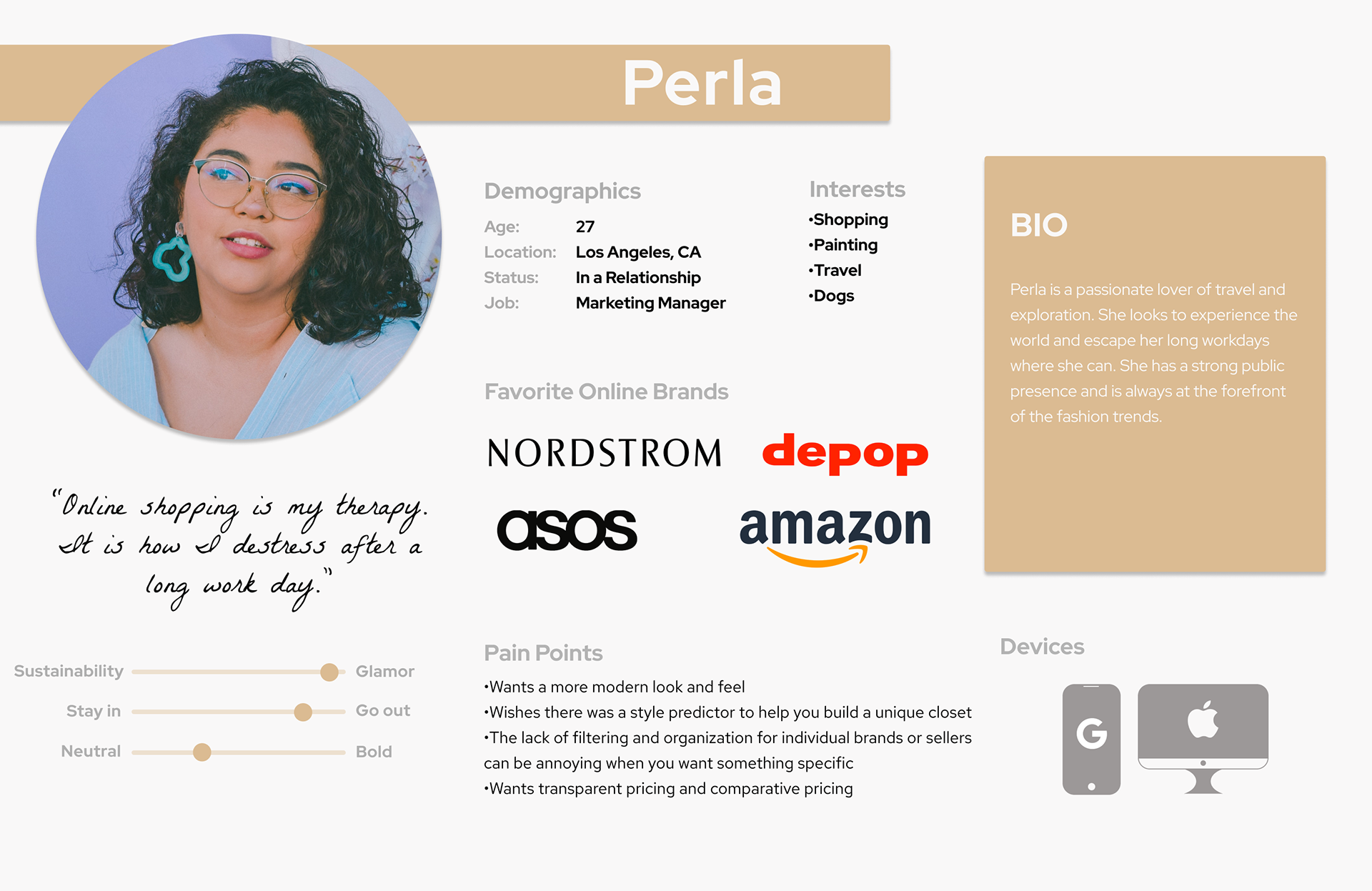
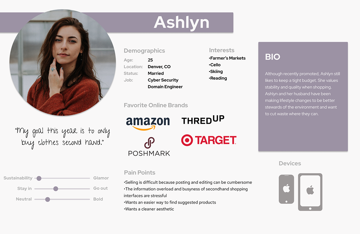
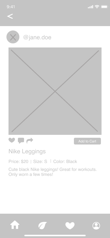
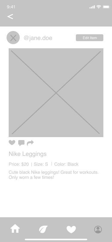
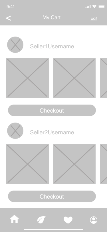
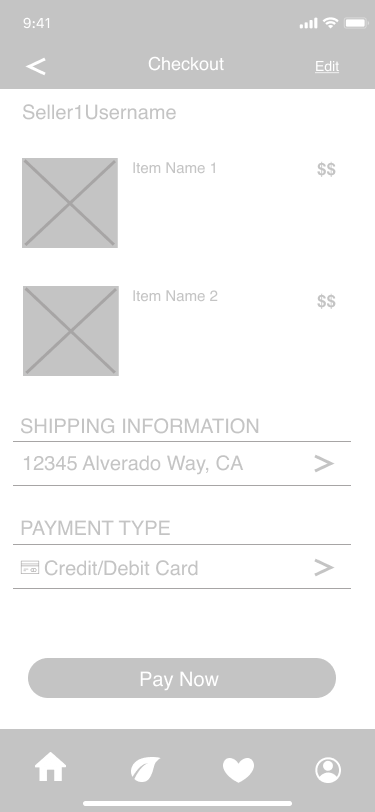
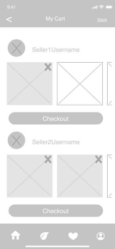
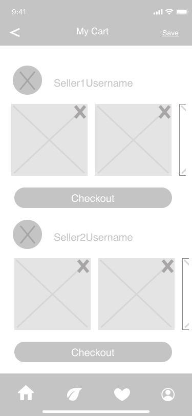
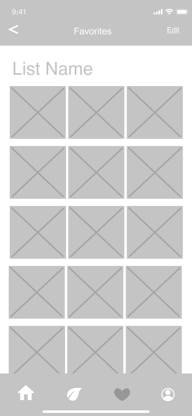
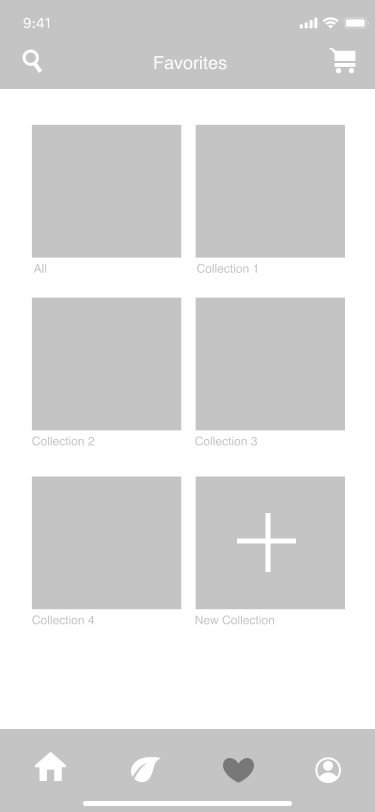
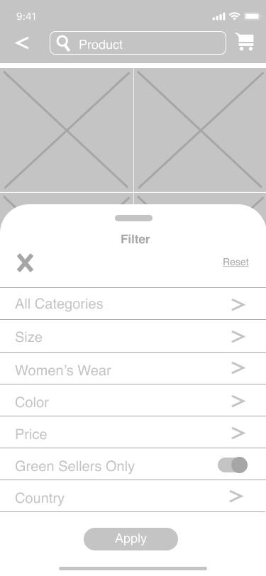
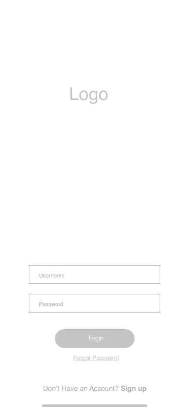
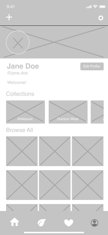
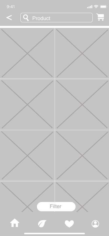
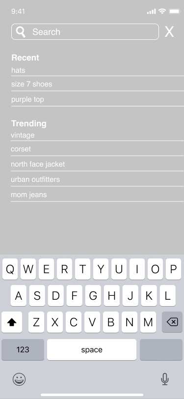
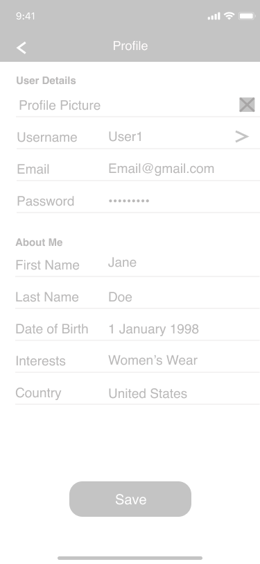
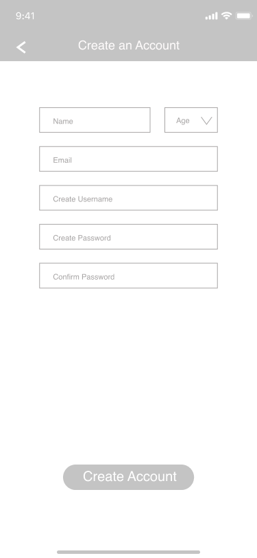
For the next phase, we designed four personas of potential users of our app. Using our research of Depop, we then created our own user flow map that would guide us as we began to create the interface. Next, we created and prototyped lo-fi wireframes to set the foundation of our app and evaluate the effectiveness of its flow.










Phase 3: Interactive Prototype and User Testing
Using our lo-fi prototypes, we returned to our initial users and asked them to test it. After, we interviewed them about their experience using the flow.
Phase 4: Moodboard, High-Fidelity UI, Design Systems
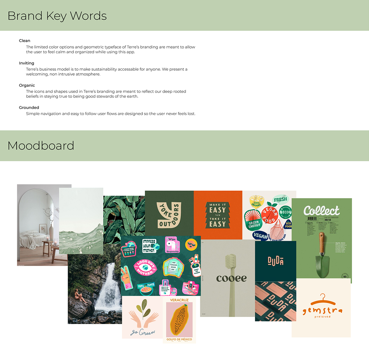
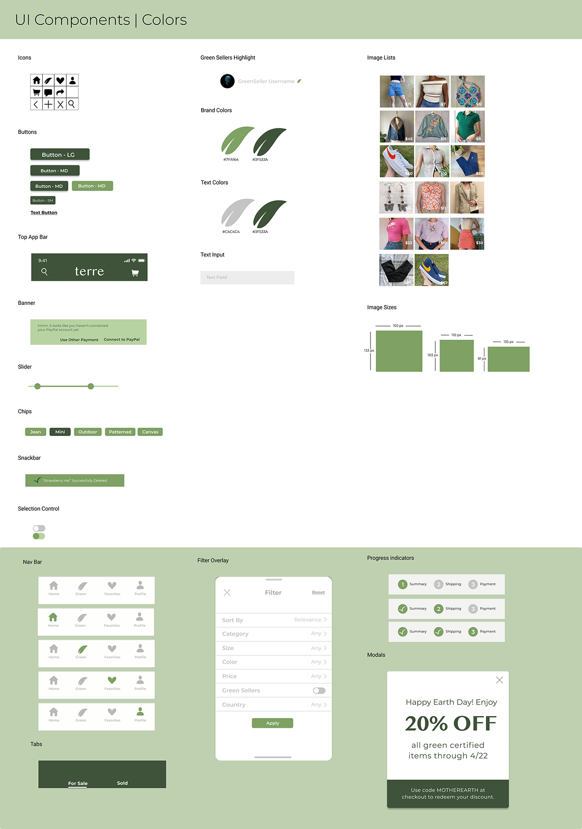
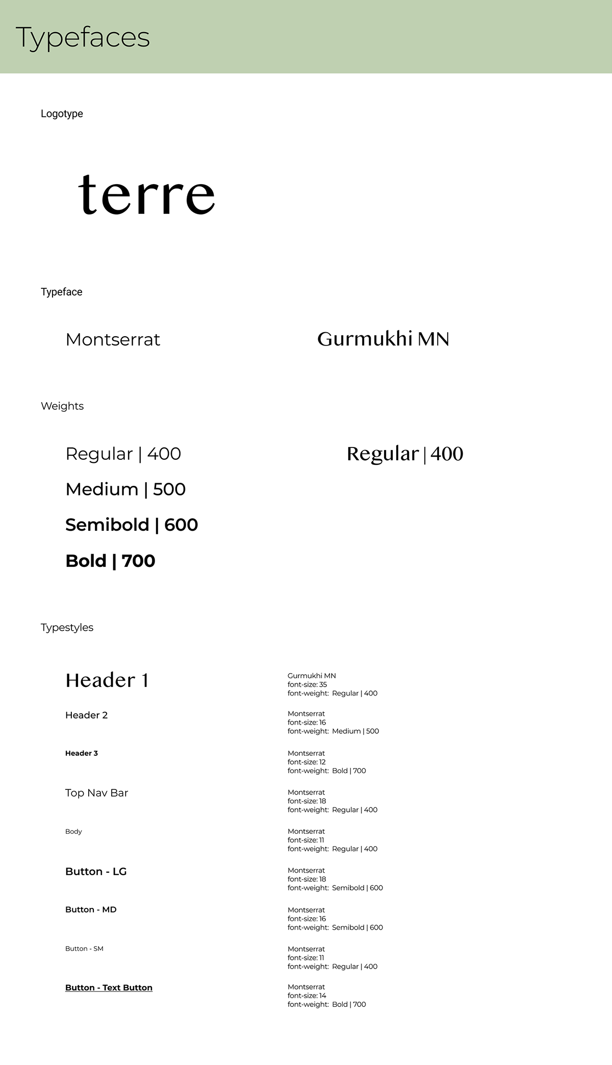
In this phase, we worked on the aesthetic of our brand's identity and our user interface. We first outlined the key traits of our brand, created a moodboard, and established our design system. Using these design guidelines, we went into our lo-fi prototype and added elements such as color, typefaces, and components.
Phase 5: Interactive Prototype, User Testing Round 2
After our high fidelity wireframe was complete, we returned to our users and tested them again. Based on their feedback we updated our app to create the final design solution.
